Year In Review: 2018
2018 has truly been a transformative year here at By Stina Faye. I am so grateful for the lessons that were learned, progress that was made and can’t help but be in awe at the amazing women I got the opportunity to work with this year. It’s safe to say that I’m destined to work with women who dare to dream big and are ready to go all in on the big picture goals they have for their businesses. To honor the visions that were made into reality, brands that were built, and businesses that were up-leveled inside & out, this post is dedicated to the highlight a few memorable projects of the year.
When you read through the projects that are highlighted below, you’ll notice one constant — a vision that all of these women hold within themselves to create something bigger than them. This year really opened my eyes to the true purpose behind the work that I do. It goes so much deeper than design and the outcome is so much more rewarding when you look past the pretty logos and fabulous websites that were developed and into the beautiful souls behind these brands.
Please join me in celebrating these women, their businesses, their brands, and all the magic that was made in 2018. I do hope this will inspire you to dedicate 2019 to becoming the year that you just went for it and went all in on your visions + your passions. I so look forward to supporting you. 💕
Rebelle Beauty
This was the project that truly kicked off 2018! The owner of ReBelle Beauty, Marcie, is an esthetician with a passion for all things beauty and has the sweetest soul. She came to me with a vision of a brand that would help fulfill her intentions of creating a space for women to feel empowered, beautiful, and safe. Marcie’s mission was crystal clear to me from the start. I was deeply moved & inspired by her own words behind the meaning of her business name, “The name "ReBelle Beauty" represents bringing back our original beauty to a state where we feel empowered—this doesn't have to look the same for everyone, rather we are united through our unconventional beauty.” During the branding process we dug deep to uncover her story and help her find her focus + unique value in the beauty industry. After a few rounds of mood boarding, brainstorming calls, and design seshes, we created a truly one-of-a-kind aesthetic for ReBelle Beauty — inspired by the freedom of the 70s, infused with the culture of modern femininity, and of course…lot’s of girl power vibes radiating throughout. Fast forward to present day, Marcie has a brand that she feels empowered by, has doubled her business, and continues to share her voice, story, and talents to build upon the legacy of the ReBelle Beauty brand.
visit the website
enlightened beauty
Working with Morgan on revamping her website was such a treat. We connected in so many ways and truly made the perfect dream team for her branding goals this year. It doesn’t take long to know that there is something really special about the woman behind this brand. Morgan’s case was unique, as she already had a logo she loved and felt aligned with her business and target audience. So our project was centered on building around her existing branding to create an online presence that actually felt like home for her and her clients. Her online presence was curated to reflect her actual client experience — which is meant to evoke a feeling of self-love. In her own words, “Enlightened Beauty is all encompassing, spiritual, and holistic. It’s created for people looking for a results driven and loving experience during a skin treatment. They are self loving, self respecting, spiritual, holistic, and deep thinkers.” We also created a space for her to start building her voice and sharing her story within her very own blog. Keep an eye on Enlightened Beauty in 2019, because Morgan has big plans for her brand and is absolutely going places!
visit the website
Addictit Eyelash Extensions
The Addictit Eyelash Extensions brand will always be near & dear to my heart. The owner of Addictit, Dejsa, was the first person to go through my now signature program, The Brand Experience. Dejsa had spent the past few years building a powerful business with clients who adore her, value her work, and a schedule that’s always full — she just needed a powerful brand to compliment it all. Going into the project, Dejsa’s goals were to create a brand that portrayed not only a love for lashes, but the lifestyle that goes along with it. She also made it crystal clear that building relationships with her brand & biz was a major part of her mission. Together, we created a really unique aesthetic that reflected her timeless sense of style with her love for the beach by infusing with vintage art deco inspirations with Miami beach-ready vibes. We really wanted the Addictit visual identity to feel like as much of a lifestyle brand as it is a beauty brand.
In addition to establishing an online presence for Addictit, Dejsa wanted to launch a clothing line to help create community & representation for lash artists around the globe. I’m so proud to mention that within just a few months of launching her website, that goal was met and her very first retail store was launched! 🎉
visit the website
nmk Skin
The story behind how Dr. Natalia Spierings and I got the chance to work together this year is one of my favorites to tell. Natalia actually found me through a 2017 client of mine, Blushtan. She had been drawn to Blushtan for it’s modern feminine aesthetic + fabulous spray tans and loved it enough to bring the brand overseas as a licensee in the United Kingdom. At the beginning of the year, I worked with her to help her set up the official website for Blushtan U.K. and from there she let me know about the personal brand she was creating for herself as a consultant dermatologist as well. Needless to say, we got along beautifully and go to work on building a brand to represent her passion for modern skincare through treatment & education. We developed an aesthetic with intentions of separating herself from the stereotypical dermatologist brand that usually comes off quite sterile & serious. She wanted to bring her playful personality and vibrant passion for skin into her visual presence and I made it my mission to accomplish exactly that for her. Fast forward to today, her brand has been built, her website is officially launched, and she has plans to develop a skincare line of her own in the very near future!
visit the website
Makeup by Tracy
This was a summer time branding project that felt effortlessly aligned from start to finish. Tracy is an insanely talented makeup artist that paved her own path into the industry and created a profession out of her passion for beauty. She spends her day making women feel glamorous, pampered and beautiful in their own skin. She has a special talent for makeup artistry that focuses on enhancing the best features of her clients faces to bring out the naturally beautiful qualities about them. Prior to us working together, Tracy spent a long time building a respected reputation, business, and clientele — but just needed an elevated personal brand to fully position herself as the industry expert she is. We worked together to create an aesthetic + brand that felt authentic to her, attractive to the natural beauties she works with, and versatile enough to work for her cosmetic line as well. The aftermath of our time together was a timeless visual identity that she now loves to flaunt and deep rooted confidence in her presence, audience, and messaging as she continues to develop her brand experience on her own.
visit tracy’s website
Charuk Studios
Collaborating with Jess was definitely a highlight of the year! Not only did she come all the way from Canada to capture brand photography & videography for me (which I will be forever obsessed with), I also had the honor of helping her develop her personal brand and build out the website of her dreams. Jess is the owner of Charuk Studios, which is the beautiful business she’s built to encompass all of her passions in photography, videography, & creative direction while sharing her lifestyle + inspiring others along the way. She has the sweetest personality & undeniable creative talent and absolutely deserved to have a brand + online home that represented that. Together we created an aesthetic + brand that felt true to her along with a website that allows her to share and be her authentic self with the online world. It’s also safe to say that her website may have been one of the most custom Squarespace designs I’ve done to this day! Be sure to check it out for yourself below, she has amazing & super inspirational content that pairs beautifully with her brands aesthetic.
visit the website
Creative Girl, Corporate World
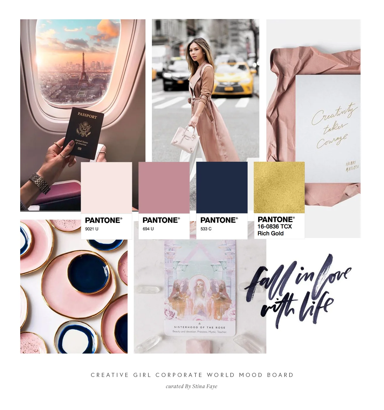
The universe truly aligned Nicole and I for a divine reason! Nicole, the creator of Creative Girl, Corporate World, came to me with a crystal clear vision and such a special story. After spending years in the corporate world, she felt called to create a bigger impact in the world. With her passions rooted in helping ambitious women build belief in themselves and reach new levels in their professional & personal lives — Creative Girl, Corporate World was born and needed a visual identity to become a reality. Together we dug deep to develop her brand story, define her target audience + her mission, and created a beautiful brand to align with it all. Since our branding project wrapped up over summer, she has since designed & launched her website on her own with her brand guidelines and has a podcast on the way!
visit nicole’s website
Lash Lioness
After already working with Courtney during my first year of business, getting the opportunity to work with her again on branding her beauty business, Lash Lioness, absolutely felt like a full circle moment. Courtney had a vision for a brand that not only radiated confidence but a business that allowed her to empower her clients with that same level of confidence in themselves. In her own words, “Lash Lioness is different because it doesn’t speak to one specific woman, it speaks to the way a woman feels about herself.” Together we developed an aesthetic & visual identity rooted in her intentions of building a brand that felt authentic to her and communicated that the work she does is so much more than lashes. Aesthetic-wise, we focused on vintage glam 70s vibes, think the confidence of a disco queen meets spiritually empowered diva goddess. We chose a deep green, rose gold, and black as her power tones to make her brand instantly recognizable from a mile away. Now as a passionate lash artist & business owner, Courtney is equipped with the visual & mindset tools she needs to continue building her brand as her business journey continues to unfold!
Artisan Lash
The time invested with Ash of Artisan Lash on building her brand & online presence was incredibly rewarding. Ash came to me with a familiar situation — she’d built a beautiful business rooted in her passions that eventually lead her to a point where she knew she needed a strong brand to continue scaling the empire she was creating. Ash also had goals of developing an online platform that allowed her to position herself as an expert educator in the lash industry, which she planned to accomplish through the launch of her lash artistry courses. During our project, we really wanted to visually convey the artisanal aspect of lash artistry all while creating a brand experience that felt personable, professional, and high quality. In her own words, “Artisan Lash is a name that came from my desire to create something more than just lashes. I wanted to convey the artistry in my craft & technique. I also loved how prestigious it sounded, like it was curated by an expert.”
Together we developed so many special details to represent the Artisan Lash brand. From her signature colors & fonts, planning her brand photography, creating compelling content for her website, and of course developing her iconic family of logos. The submark that was developed for the Artisan Lash brand identity is hands-down one of my favorites. It’s strikingly significant, yet infused with simplicity — communicating the unique value behind the Artisan Lash brand without using any words at all.
visit the website
Etre bien
Talk about a dream project! Tori, the owner of Etre Bien, came to me with a truly unique business concept rooted in high-vibe self-care through organic, crystal infused products created to elevate our everyday rituals. It was really important for Tori to have a brand identity that not only authentically represented her mission & passion for mindfulness & self-care, but also to develop a presence that felt truly unique to her business to help her really stand out in an industry she felt was oversaturated. Together we developed an aesthetic that brought true meaning to her brand, created significance in it’s French inspiration, and radiated positive vibes. Her rebranding has since been applied to her new product labels, styled photography, marketing materials, social media, and the full website revamp will be coming up next in early 2019!


